


Hello, everybody. I’ve been thinking about two particular music projects, and I’d love to explore them here.
I AM ENOUGH
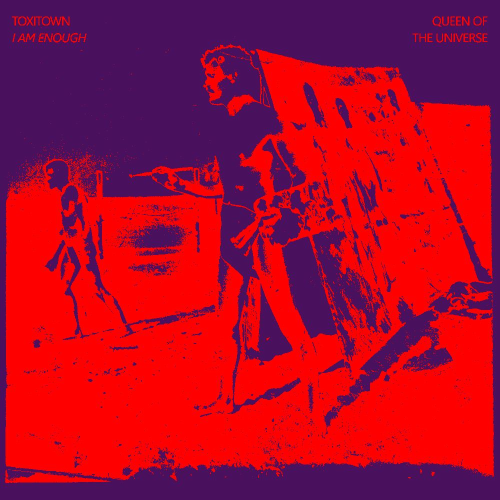
Last year I made an experimental album called “YOU ARE WORTHY OF LOVE”, a “split” project between my main band Toxitown and my silly drag persona, the Queen of the Universe. I was inspired on that record by harsh noise acts like Merzbow, but mostly I was interested in exploring an ASMR-esque soundscape — hence the affirmational title.
I am currently working on the follow-up, entitled “I AM ENOUGH”. It will operated within a similar vein to what I did on YOU ARE WORTHY OF LOVE, but I wanted to push it in a different direction.
Lyrically, it is very stream of conscious, very much inspired by positive affirmations and mysterious, foreboding symbolism. Sound-wise, it is still verrrryyy rough, but a bit more hip-hop, with shorter and more contained ideas.
Monochrome Symphony Recorded Performance
I recently released my rendition of Yves Klein’s Monotone Symphony, an early entry in the minimalist music genre.
The original performance conducted by Klein consisted of two elements, the first being the music itself, twenty minutes of a sustained d chord played by a ten-piece orchestra. The production also included the "living paintbrushes”, a group of nude women who covered themselves in the classic international Klein paint and dragged each other over giant canvases on stage. A real aesthetic revelry for sure.
In the subsequent adaptions of Klein’s symphony after his passing, the nude women were cut out. I can imagine it would be a bit of a logistical nightmare to pull off. But when I was working on the music for my version, I couldn’t help but explore the idea of creating a visual accompaniment. And I’d like to muse about ideas, basically.
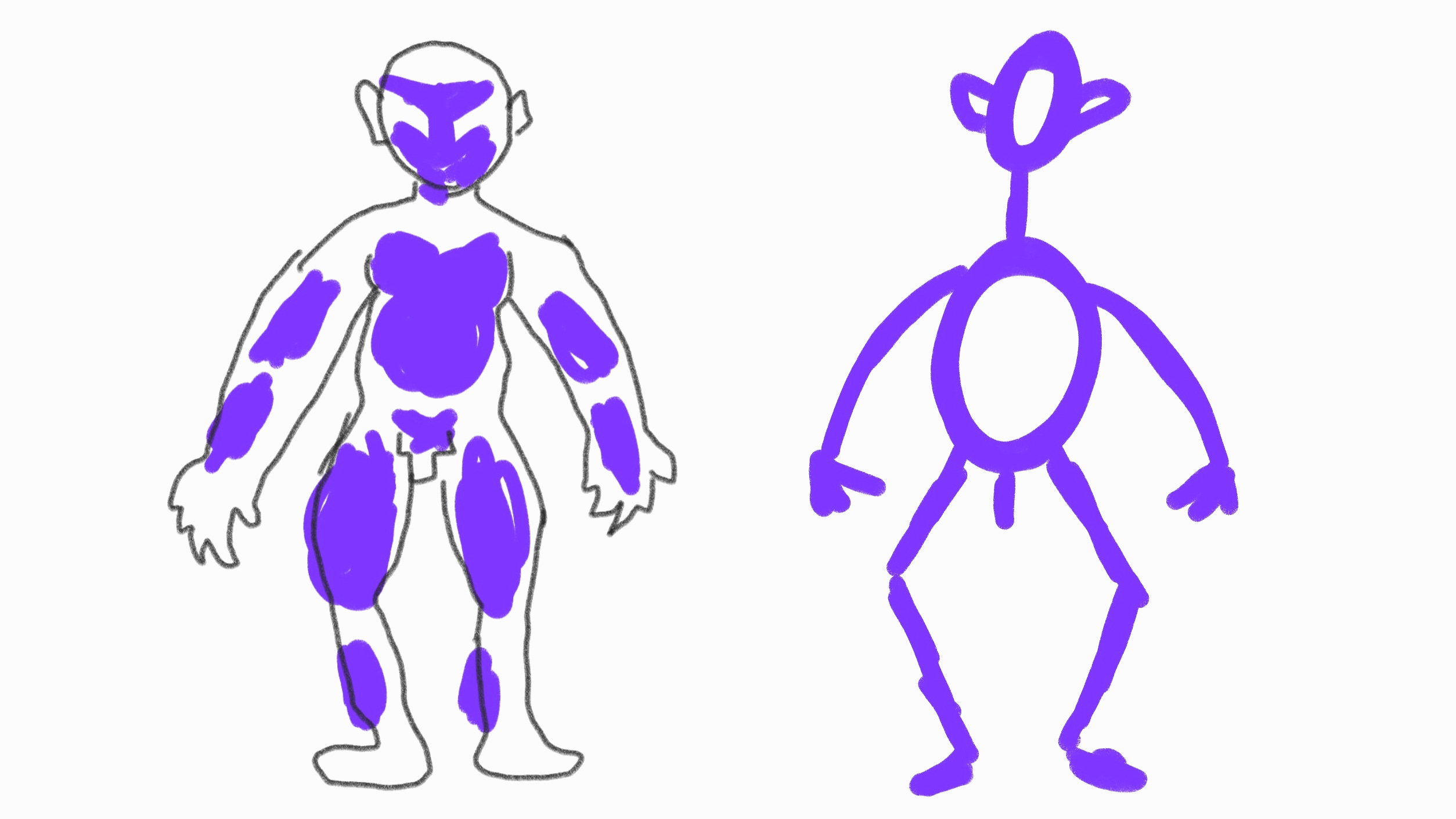
I’m pretty sure I’d do it as a solo performance (and no need to fret — I would wear clothes). I originally had the idea to roll around in mud, which is, um, swinging too far in the opposite direction.
My current idea is to use purple powdered chalk to create a life-size portrait. I’d construct the canvas out of 2x4s and white fabric or paper. The image above illustrates two materializations. In the first one, I would coat myself in the chalk, press my body to the canvas to create an impression, then use black paint to create a simple outline. The second would be more cave-painting like.
The form of the portrait is intentionally abstracted to be more universal. Purple is my favorite color, but I think the contrast between blue is fascinating — nonprimary, nongendered or perhaps gender-blended, extravagant, personal.
That is all for now. Thank you for reading.
Jerek